
Challenge:
Redesigning the visual identity in a modem way highlight the company’s commitment to sustainability and environmental preservation, showcasing our forward-thinking and eco friendly values.
Solution:
design a simple, modern Identity that incorporates elements symbolizing sustainability and the company’s strength. By using clean, minimalist lines and natural color palettes, well highlight our commitment to the
environment. At the same time, bold typography and strong design elements will convey the company’s reliability and robustness. This balanced approach ensures the brand is both contemporary and reflective of our core values, making it memorable and impactful.
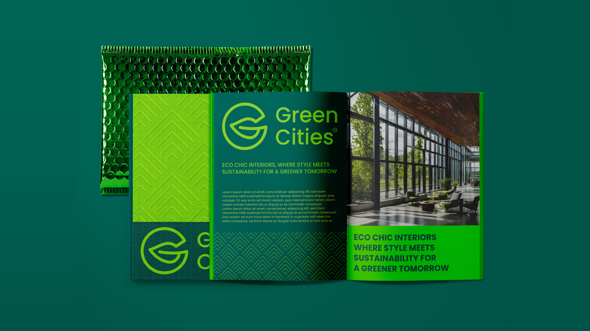
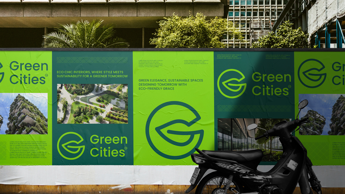
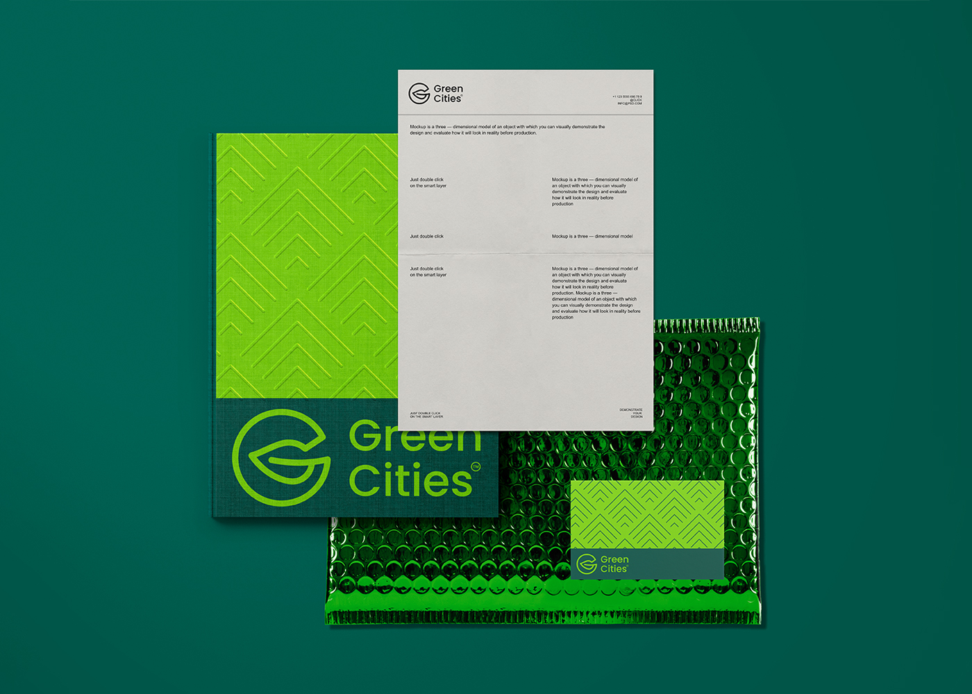
Concept:
After thorough research, we discovered that the circle is a powerful symbol of sustainability. We integrated this with the first letter of the company’s name and combined it
with a tree leaf, reinforcing the company’s commitment to sustainability. This fusion created a distinctive icon that perfectly represents the brand. Additionally, we used
green colors to highlight the company’s dedication to environmental preservation, ensuring the identity is both meaningful and visually cohesive.
Green Cities
Construction
KSA
2024